Close
Choose Shop Pay at checkout and pay in 4 interest-free installments on orders between $50 and $3,000.*
How it Works:
* Payment options are offered by Affirm and are subject to eligibility check and might not be available in all states. California residents: Affirm Loan Services, LLC is licensed by the Department of Business Oversight. Loans are made or arranged pursuant to California Financing Law license.
Close
United States and Canada
*Canada shipping charges will be based on current currency conversion rates
Color
As a commercial food and drink photographer, Friends with Vision photographer, Scott Choucino notes that, “Color is everything to me – especially with recent shifts in trends towards more visually graphic advertising.” Here, he shares his thoughts on his work.
Believe it or not, 99.9% of the photographs I see in my mind are black and white, though I tend not to actually work in black and white these days. Working as a commercial food and drink photographer means that the vast majority of my work needs to be in color, and thankfully, this matches my personal preference – it just takes me a little more work to find the color images in my head.
Working closely with my agent, in recent years, I have put together a body of work inspired by artists such as David Hockney and Andy Warhol. The idea of using bold colors and repetitive compositions really sings to me. I have never been one for pastels or wishy-washy hues. Even in my black and white days, I liked simple compositions with very high contrast. With color, I like my reds to be really red, printed on a wet gloss paper that looks like it is still dripping. I also have a very open relationship with reality in my images, from the subject matter through composition and especially color, (I will get to this later).
When learning to work with color, we often reach for contrasting colors on the color wheel for instant visual energy. These are easy “wins” and as much as I enjoy this, I think the real fun begins when you start to bring color clashes into play, add subtle hue shifts within the same color throughout the scene, or, as I have recently done, make single-colored images where the subject and the setting are identical in tone. To achieve this, I often have paints matched to the subject item so I can paint the set in the same color. I especially love a great red-on-red image.
Due to the nature of my work, I have a pretty specific workflow. I use the same 3-step approach for my commercial work as I do for my personal work, right up until post-production. My first step is pre-production. This can be as complex as having a crew, directors and stylists involved or me simply running through a hobby craft store trying to find cards and paper in the colors I need. Planning what to photograph and which colors to throw into the mix is really important at this stage.
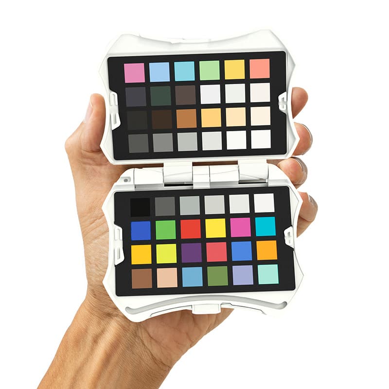
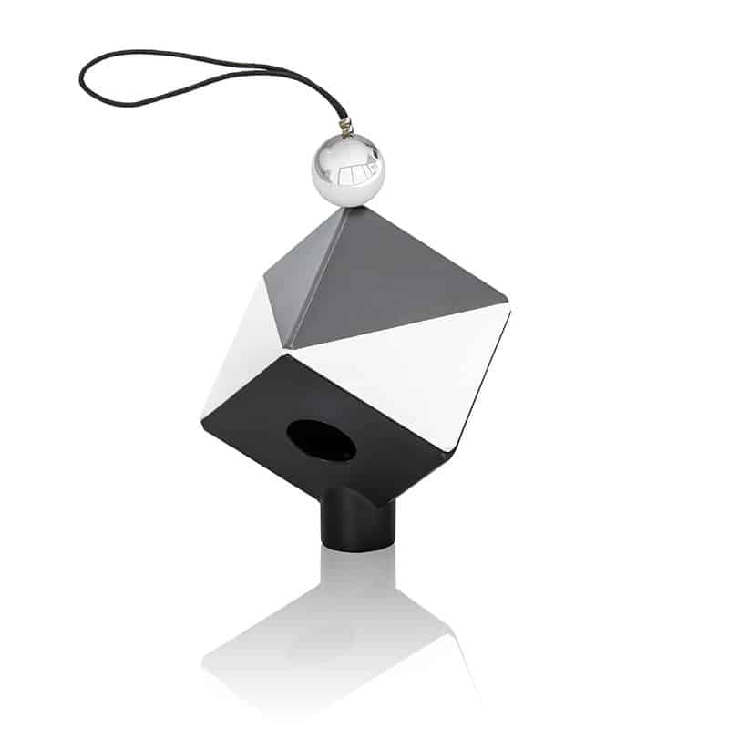
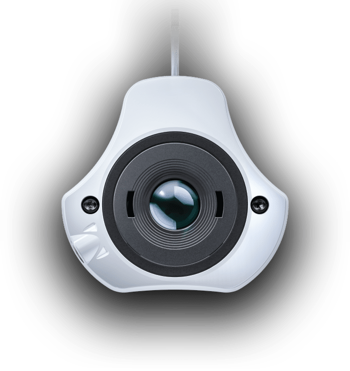
The next phase is capture. It usually starts around 8am where my tether station in my studio and main Ben Q monitors in my office get calibrated for the day using my Spyder X. While the monitors are warming up, I begin working with my team to build the first set. I use a Cambo Actus camera with Sekor lenses on a Canon 5dsr body for my personal work which allows me to get incredible depth-of-field from really strange angles while keeping sharpness as high as possible. I use Broncolor lighting for best output and color accuracy and I always have my final frame as a color chart.
The final part of the shooting phase is also the first part of my post-production. Having accurate colors before I begin post-production is key. For commercial work with certain products, I have to have as close to a perfect color reproduction as possible for legal reasons. And for my personal work, I find it far easier to start with the correct colors and then start playing with them, rather than start in a bad place and really struggle with hue shifts and the like. I like to edit from my office, where my monitor is set to a perfect height and distance, I have dark grey walls and special desk lamps which ensure the contrast of my screen remains as neutral as possible. Knowing that what I see on my monitor is as close to what the image will look like in print is a crucial part of my workflow. Not only does it mean that my images come out as I see them, but it also saves me a lot of time and money avoiding re-edits and managing to get a good final print as quickly and efficiently as possible.
With the future of visual marketing looking increasingly to backlit devices from point of sales and billboards through to the phone that you are probably reading this on. A good solid understanding of how to use color to capture someone’s attention is key to the modern working professional photographer
Related Posts
“Keeping it Real” – No Matter Where You Shoot! Part 2 by Hernan Rodriguez
Questions for Susanne Scholl
Questions for Marcus Westen