Close
Choose Shop Pay at checkout and pay in 4 interest-free installments on orders between $50 and $3,000.*
How it Works:
* Payment options are offered by Affirm and are subject to eligibility check and might not be available in all states. California residents: Affirm Loan Services, LLC is licensed by the Department of Business Oversight. Loans are made or arranged pursuant to California Financing Law license.
Close
United States and Canada
*Canada shipping charges will be based on current currency conversion rates
Q & A: Benjamin Moore’s 2023 Color of the Year
Autumn is when paint companies come out with their respective Color of the Year for the next year, based on a number of different factors. In this Q & A, Andrea Magno, Director of Color Marketing & Development at Benjamin Moore, shares insights about the company’s choice for Color of the Year, and how to incorporate it into home décor.
Tell us about the Color of the Year – what it is and how do you define this color?
The Color of the Year 2023 is Raspberry Blush 2008-30, a saturated red-orange that enlivens our surroundings while awakening our senses with charismatic color. This vivacious color is unapologetic in its boldness as it encourages a confident color statement.
How do you decide on a Color of the Year?
The Color team at Benjamin Moore spends months researching, recording observations, and sharing a wide array of ideas that are ultimately synthesized to guide the curation of the Color Trends palette and select the Color of the Year. Through this work, our aim is to analyze where the societal mood or inclination is headed for the coming year, and how we can use these cues to determine where the general color direction is headed. From there, we look at overarching color trends and how we can relate this to the many ways in which color is brought into the home.
If you had to pick a single overarching influence for this color being chosen as Color of the Year, what would it be?
We observed the impact that bold color has whether through energetic color used in art, the vivid colors of nature, and drenching spaces in color for an engaging, sensorial result. This brought us to a reoccurring theme around the willingness to be creative and expressive through color, even if it meant breaking away from the tried and true.
Why this color now? What do you feel this color brings to home décor?
While we love neutrals and our collection of off-whites with their subtleties that have been very popular over the past several years, we identified a need for an upbeat energy in rooms – a quality that color can surely deliver. This desire to bravely dive into color brings excitement and a new-found vitality that comes to life with Raspberry Blush and the rest of the Color Trends 2023 palette. For 2023, the time is right to take a confident step forward in our color selections to truly embrace the transformative power of color and paint. For some, bringing a saturated color into the home may be done in a small gesture of color, while for others the time has come to make a fearless color statement.
What other paint colors work well with (color of the year)? What other design elements?
To guide our customers through the color journey and make using bold colors more approachable, we feature four neutrals in our Color Trends 2023 brochure that will pair well with this dynamic palette. The colors included are White Heron OC-57, Etiquette AF-50, Gray Owl OC-52, and Onyx 2133-10. For example, a room with great millwork or moldings painted in one of the neutrals paired with Raspberry Blush would instantly energize a space, while creating a nice balance between bold color and reliable neutrals.
How do you best work with this color in various décor styles? (modern, farmhouse, cottage, Japandi, etc.)
Raspberry Blush certainly lends itself to the popular maximalist styles we are seeing in many inspiring and fun images, and it can also work its way into traditional or modern styles. For popular décor trends that have an overall softness or reliance on a neutral palette, Raspberry Blush may be used as a smaller accent to punctuate a space, inserting and energetic dash of personality. The character of a boho look also lends itself to Raspberry Blush, as this color can complement an eclectic play of pattern and color.
What’s your favorite way to use this color? If you could create a perfect décor setting for this hue, what would it be?
As we developed the Color Trends palette and selected Raspberry Blush as our Color of the Year, we thought back to the traditional red dining room of the past. We see Raspberry Blush as an opportunity to bring a renewed, fresh take on this idea to create a lively dining room that is sure to inspire a lively gathering. We also love this color as an entry color because this hue will set the stage with personality while welcoming guests in a confident and energetic manner.
How would you encourage people to try this color in their own home?
Taking the plunge into deep, saturated or chromatic colors can be daunting, especially when we’ve become so comfortable with all-neutral spaces. Moving back into color may require a leap of faith, but the results will be impactful and will showcase great color confidence. A way to move into using color may be through a small accent, or even painting a room such as a study, powder room, or another space where a standalone color will work well. Using samples is also a great way to test drive a color – sometimes adjusting to using a stronger color can be an important step to become comfortable with bringing a transformative color into a room.
Warmth, nostalgia, nature and sustainability are prevalent trends in paint colors for 2023 – do you feel (color of the year) follows one or more of these trends? If so which ones and how? If not, do you see it fitting into another trend?
We’ve been tracking the move to the warmer side of the color wheel after many years where cooler colors dominated, and we felt that 2023 is the right time to really make a statement with a warm color. Over the past two years we’ve included colors that fall into the red-orange family, but they had a slightly muted quality. For 2023 we wanted to a red-orange that captured the warmth and saturation that makes for a charismatic color statement.
When developing the palette, we noted many retro or nostalgic influences with designs that brought us back to different decades, whether the 70’s, 80’s or 90’s, resulting in an eclectic mix. Nature came into the story as well, but rather than focus on the softer or more organic colors in nature we looked at the bold or even fiery colors – think of a sunset or the captivating depth of color of the Mediterranean.
Another trend we are also leaning into the desire for self-expression and making a statement. We started this story in 2022, and we are taking it to the next level by bumping up the saturation for 2023.
How does this color work as part of overall color palette trends for interior décor for 2023 and beyond?
Raspberry Blush leads the way for the palette of saturated, uplifting hues included in the Color Trends 2023 palette. Each color has a distinct personality and can stand on its own for fantastic results. The confidence and charisma of Raspberry Blush is contagious, inviting us to push outside of our comfort zones and into an amazing color experience.
Related Posts
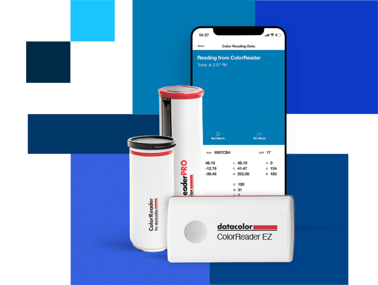
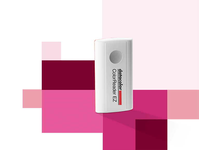
ColorReader EZ – #fromthistothat: A use case in product photography
Perfect color coordination is the be-all and end-all in product photography, because advertising is a very visual experience. In addition to image composition and form, one other aspect is of particular importance: color. Vera Wohlleben, a German blogger, photographer and stylist for food & stills, uses Colorreader EZ for such cases and explains how she uses it.
Painting Tips from the Experts
Boost Your Home’s Curb Appeal with Color