What Color Is Your Product and Why Can’t We All Just Agree?
When it comes to the color of a product, it is often hard to get consensus. We all remember the heated debates we had on that white and gold or blue and black dress. So why can’t we just all agree? Well, there are a few factors at play.
1) The Chameleon Effect
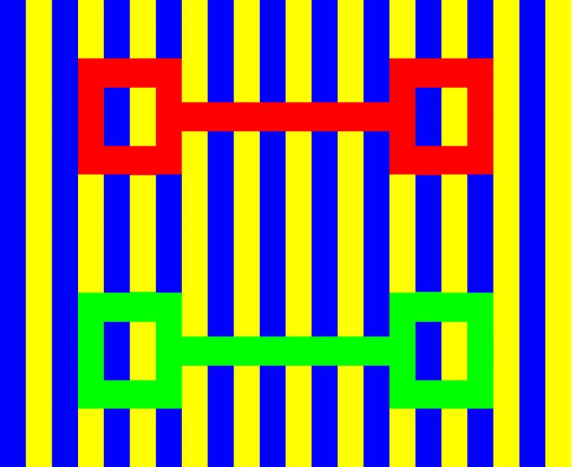
Which set of red squares appear darker in the image below? And which set of green squares appear darker?

They are actually the same color.

Our eyes can deceive us when backgrounds change. Consider how you evaluate colors and the backgrounds you use.
2) Simultaneous Contrast
Is each circle the same color?

The answer is Yes

A light color placed next to a darker color will appear lighter by contrast with its surroundings. Consider this as you visually evaluate your own standards and production samples
3) Assimilation
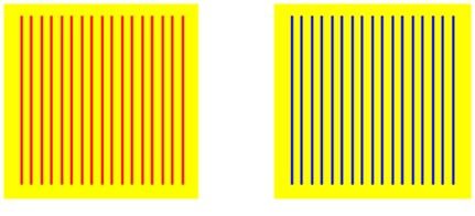
Assimilation is the reverse of the simultaneous contrast effect. Which yellow background appears darker and warmer?

The yellow under the red stripes appears warmer than the same yellow under the blue stripes.
4) Successive Contrast
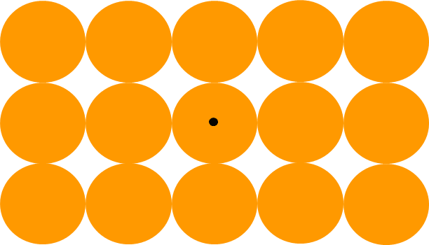
So far, all the effects have been instantaneous. Other effects are based on the cones in your eyes becoming fatigued. Stare at the black dot for 5 seconds, then page down and keep staring

After staring at the orange pattern for a few seconds, then switching your gaze to the empty field, you will see a negative-colored after-image

What does this mean to you?
It means, visual color assessment or using humans exclusively for color evaluation will have some significant limitations:
- Visual color evaluation is subjective
- Observers have differing color vision and, therefore, color opinions
- Color differences are difficult to quantify and communicate
- Many variables need to be controlled including light intensity, angle of view, surround color and light source quality
This doesn’t even take into consideration of other facts about our color vision, such as:
- 1 in every 12 males (8%) is color defective as a function of their single x chromosome
- 1 in every 250 females is color defective (0.4%)
- The most common color deficiency is a partial green defective
- Being color blind is rare, only 1 in 33,000. You would be missing all three receptors known as Acromatopsia and the individual is called an “Achromat
And there is one more reason – Metamerism.
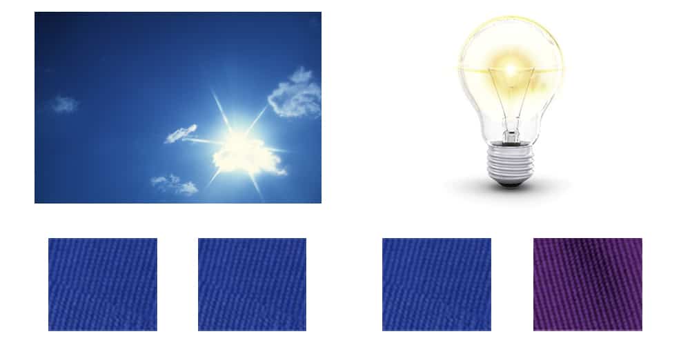
Metamerism occurs when two samples appear to match under daylight viewing conditions, but do not match under other lighting conditions, such as fluorescent, incandescent or LED.

Now you are wondering if there are ways to overcome these limitations in color evaluation. The good news is, there are:
- Proper light source selection:
a. Use established industry standards, if defined – OR – Choose light sources that fit your specific application
b. Everyone must agree to use the same light sources and procedures throughout the QC enterprise
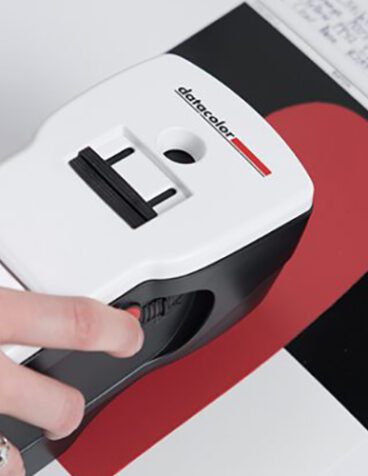
- Leverage Spectrophotometers to analyze spectral distribution of reflected or transmitted light, wavelength by wavelength, across the visible spectrum; and measures the ratio of reflection or transmission by a specimen relative to a reference standard will give you the objective color data you need to make an informed decision.


