What Is a Good Color Match in Design versus Industry?
Whether you’re a designer, product developer, or quality control manager, achieving a good color match is critical to success; but what that means can vary depending on your role. Understanding how color matching works, and how to move from color design to color execution, is key for maintaining brand consistency, product quality, and customer satisfaction.
In this post, we’ll explore:
- What a “good color match” means in design versus industrial settings
- How to bridge the gap between design and the supply chain
- The essential tools and techniques for industrial color matching
- Why investing in color matching tools supports quality, efficiency, and brand trust
What Is a Good Color Match?
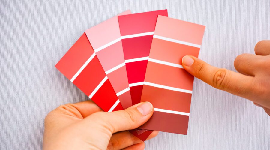
At its simplest, a good color match means two colors appear visually identical, or nearly so, when placed side by side. In creative fields, this visual similarity is typically judged subjectively by designers or clients, and can be influenced by the viewer, lighting, background, and environmental conditions.
In these creative contexts, terms like color palette and color scheme are foundational:
- A color palette is a curated selection of colors used to guide design.
- A color scheme refers to how those colors are arranged to create harmony or contrast.
Understanding how to build and use palettes and schemes is essential for professionals working with color to evoke emotion, define aesthetics, or create visual appeal. For these professionals, a good color match means the final product aligns with the original design intent and resonates with the target audience.
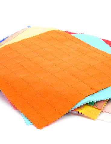
What Is a Good Color Match in the Industrial World?
In manufacturing, color matching is more than aesthetic. It is quantifiable, repeatable, and reproducible across batches, suppliers, and materials. A good industrial color match meets specific color tolerances based on objective color measurement, ensuring consistency despite environmental or material differences.
But it doesn’t always mean achieving the most perfect match possible. In many cases, a “good” color match is one that balances multiple priorities:
- Cost efficiency: A visually acceptable match using less expensive dyes & pigments or fewer formulation steps
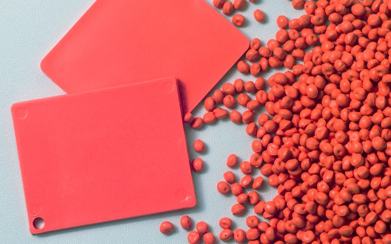
- Sustainability goals: A match that uses less water, fewer chemicals, or more eco-friendly materials
- Raw material constraints: A tolerable match made with available or approved & compliant ingredients
Additionally, industrial color matching must account for more complex phenomena like metamerism (when colors match under one light source but not another) and color constancy (perception of a color staying consistent across lighting changes).
For example, a global sportswear brand’s core colors must appear consistent across apparel collections, footwear, and accessories, even when these items are produced in different materials and by different suppliers. Without precise color control, small differences can erode brand recognition and lead to costly rework.
That’s why industries rely on color matching tools and techniques grounded in color science.
Bridging the Gap Between Design Intent and Production Reality
Bringing a creative vision to life in production is often more complex than it appears. While color palettes and brand systems serve as essential starting points, they are based on subjective visual judgment. This becomes a challenge when that vision must be replicated precisely and consistently at scale.
Design teams may begin with physical swatches, yarn wraps, or printouts that convey color intention but lack the specificity and stability needed for manufacturing. In ideal scenarios, these visual references are tied to color standards. But even color standards can fall short unless they’re mastered to unwavering digital color data that allows for objective control.
The gap between design and manufacturing is most apparent when color appearance varies due to differences in substrate, texture, lighting, or process. That’s why digital color standards are indispensable in industrial environments. They offer a shared, quantifiable target that unifies designers, developers, suppliers, and production team; ensuring consistent outcomes across the entire supply chain.
Subjectivity alone:
- Doesn’t account for substrate variability or environmental conditions
- Struggles to maintain consistency over time or across locations
- Cannot deliver the accuracy required for high-quality manufacturing
While color standards define visual expectations, it’s the integration of digital, objective color data that makes those expectations achievable. Industrial color matching succeeds when creative vision is supported by objective color management processes.
How Does Color Matching Work in Industry?
Reliable industrial color matching depends on several core components, all of which benefit from color matching tools:
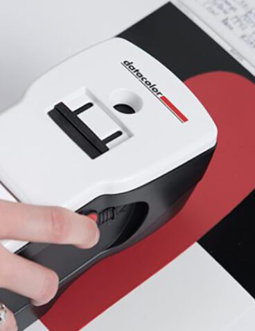
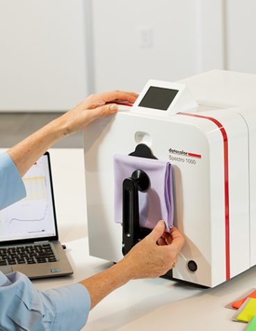
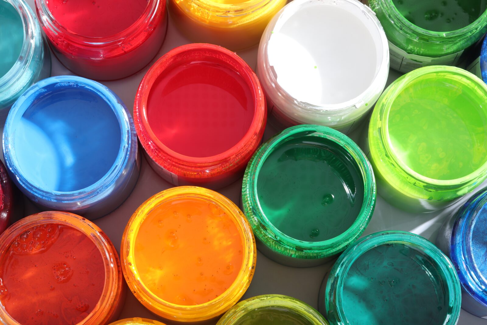
- Color Measurement
You can’t manage what you don’t measure. Devices like spectrophotometers quantify how a sample reflects light, offering objective comparisons regardless of texture, material, or lighting. This forms the foundation for accurate color matching.
- Color Formulation
Once a target color is defined, manufacturers must determine how to reproduce it using available dyes or pigments. Color matching software predicts the optimal recipe to meet the target, balancing accuracy with constraints like cost, compliance, or raw material availability.
- Color Correction
Even with accurate color formulation, real-world production often requires fine-tuning. Color correction tools help adjust the recipe based on measured samples to bring them within acceptable tolerances. Color management software like Datacolor Colibri speed up this process and improve reliability.
- Color Communication
In global operations, digital color communication is essential. Sharing digital color standards, measured sample data, and formulation outcomes ensures that every stakeholder is aligned, reducing delays and rework. When integrated into business systems such as PLM or ERP platforms, color management software can streamline approvals, speed up workflows, and enhance collaboration between design, sourcing, and production teams.
- Controlled Visual Evaluation
Visual color match checks still matter, but should be conducted under standardized conditions. Light booths provide consistent, controlled environments to assess samples under various lighting scenarios, making final approvals more trustworthy.
Why Industrial Color Matching Matters
Getting your color match right isn’t just a technical challenge, it’s a business imperative. Accurate color matching supports:
- Brand integrity and consumer trust
- Product quality and reduced rejection rates
- Faster production cycles and time to market
- Less waste and lower costs
Across industries, color accuracy plays a critical role in ensuring brand consistency, product quality, and customer satisfaction. From consumer goods to industrial components, a color mismatch can delay launches, increase costs, or undermine trust.
Final Thoughts: From Creative Vision to Production Precision
A designer’s color palette sets the tone, but it’s the role of color managers, quality teams, and production specialists to make that vision a reality. By investing in color matching tools and objective processes, organizations bridge the gap between design and manufacturing.
Whether you work in product development or manage color operations, understanding how color matching works, and why it matters, is essential for delivering consistent, high-quality products.