This article by Ken Butts, Global Key Account Team Manager at Datacolor, originally appeared in TextileWorld.
Designers and colorists know how difficult it can be to get fluorescent colors right. Yet it’s also undeniable that these colors have a very strong draw on consumers across multiple categories, including sportswear, swimwear, and more. So, despite the difficulties they present, the payoff can be great.
But what makes fluorescent colors so hard to achieve?
Shedding Light On the Challenge
Most colors becomes darker as more dye or pigment is added to the fabric or other substrate. The results can be measured precisely using a spectrophotometer – a device that reports the amount of light reflected from the material across the visible spectrum. This measurement, known as a reflectance curve, effectively provides a “fingerprint” for the color and enables extremely predictable matching.
Fluorescents, conversely, work in the opposite way. As fluorescent dye is added, the fabric absorbs more ultraviolet (UV) light and reflects it as visible energy – making colors brighter and more intense.

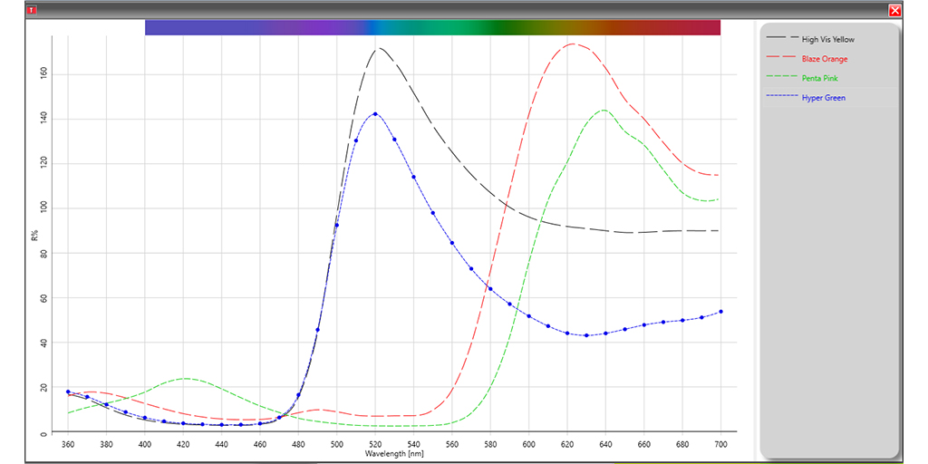
Figure 1: Example of reflectance curves for four fluorescent color samples
Figure 1 shows the reflectance curves for several common fluorescent colors. All four numbers have values that exceed 100 percent. This means they’re reflecting more energy than was present in the visible portion of the light source when they were measured – which makes the samples look brighter than non-fluorescent colors.
“The hardest part about fluorescents is setting expectations with designers and merchandise partners in terms of what is feasible,” said Kristen Bell, Manager of Color Development for Carhartt Inc. “Design loves them because of the lift they provide to the floor and they’re eye-catching for the consumer. But not all substrates can match to our standards.”
Keep Reading!

