By Jennifer Jagolinzer
A well-matched integration between an innovative design team and a meticulous color management process is essential in turning visions into reality, allowing concepts to be brought to life vividly and accurately. This is foundational for brands in creating their identity and forming a heartfelt connection with consumers.
To achieve this, cultivating a cohesive and mutually beneficial partnership between design and color management teams is key. Having spent 30 years in product development – with a concentration on color management at notable brands like NOBULL, New Balance, and the TJX Companies, Inc. – I would like to share my top tips for designers working with their color management teams.
1. Understand Your Color Management Process
Key takeaway: A well-understood process minimizes confusion and enhances productivity.
Acquaint yourself with the intricacies of your organization’s color management workflow, including the available data and reference materials. If the existing process seems fragmented or inefficient, seeking clarification or help is vital. A transparent and cohesive process is paramount for navigating the complex world of color management effectively and ensuring everyone is on the same page.
2. Streamline Your Color Palette
Key takeaway: A cohesive, core color palette ensures brand continuity and mitigates complexities.
Dive deeply into the essentials and resist the allure of an overflowing palette. A well thought-out, consistent core palette is crucial for optimizing costs and sustainability. An expansive seasonal color spectrum might seem appealing but often introduces unforeseen challenges and complexities. Mapping out your palettes by lightness and chroma can support your decisioning so that you don’t end up with 10 “navy blues” that could be optimized into three.

3. Enhance Your Color Knowledge
Key takeaway: Continuous learning empowers designers to make informed decisions.
Keeping yourself up to date and refreshed on the science of color is indispensable. Check out these resources from Datacolor®: Refresh with some of the basics of color. Continual learning allows for enhanced communication and collaboration with color managers and contributes to an informed decision-making process, leading to optimized and efficient designs.
4. Utilize Objective Color Standards
Key takeaway: Reliable color standards and tools pave the way for accurate color realization.
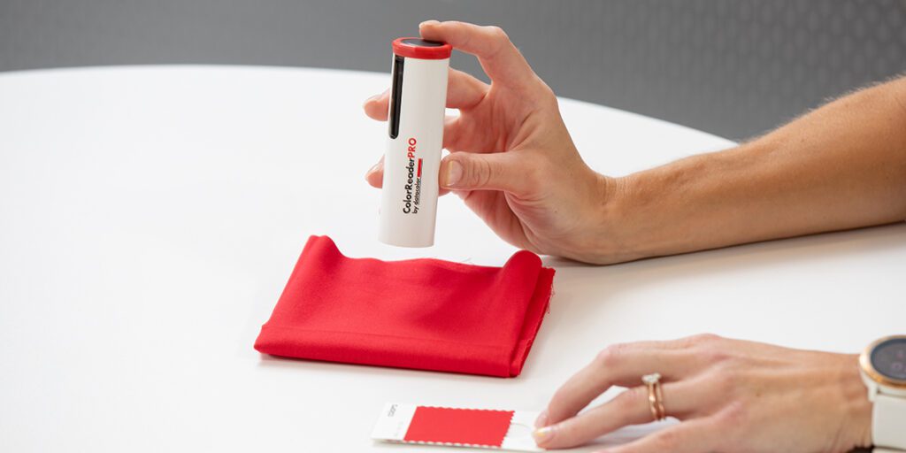
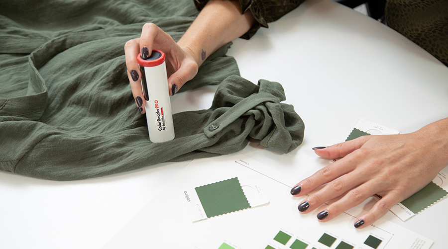
Adopting established color standards from providers like CSI or Coloro ensures accuracy and consistency, avoiding the pitfalls of relying on one-of-a-kind samples. Color selection tools like ColorReaderPRO can assist you in finding your visions within the libraries of feasible color standards, minimizing surprises and disappointments down the road. Quality color standards serve as a common language between designers and color managers, fostering seamless collaboration.

5. Anticipate Variability in Components
Key takeaway: Understanding the intricacies of different materials prevents unforeseen discrepancies in final products.
Perfectly matching color across varying components and materials can be challenging. Different materials and fabric constructions can create discrepancies in appearances due to their unique textures and finishes. Understanding how different materials interact with color helps in anticipating and mitigating factors such as texture, metamerism, and fastness, setting the expectations of uniformity and coherence in the final product.
6. Cultivate a Willingness to Compromise
Key takeaway: Flexibility in color choices optimizes timelines and relationships.
Balancing design aspirations, time constraints, and supplier relationships is the keystone of successful color management. Sometimes, being flexible with shades can prevent significant delays and streamline the process, proving beneficial for all parties involved. Recognizing when to adapt and compromise is integral for meeting product development timelines and delivering on-trend products to your customers in time.

7. Prioritize Product Calendar Deliverables
Key takeaway: Effective time management is crucial for meeting deadlines.
Being cognizant of the product calendar and understanding the time implications of each decision are critical. Additional lab dips can potentially extend the timeline by weeks, and revisions can tack on even more time. Therefore, a clear vision and decisive approach are both indispensable for maintaining project momentum and ensuring that deadlines are met.
8. Maintain Open Lines of Communication
Key takeaway: Communicating challenges early ensures swift resolutions.
Establishing robust communication with your company’s color manager is essential. Proactively addressing and communicating color challenges prevents subsequent complications and ensures that issues are resolved promptly and efficiently.
Conclusion
Professionally managing color is as much about relationships and shared passion as it is about precision and brand narrative. When it comes to the business of color, collaboration, and willingness to learn are our greatest assets. By building strong connections among the many color professionals through our color journey, we enhance our collective knowledge and ability to overcome challenges, ultimately contributing to a more efficient, sustainable, and colorful world.
About the author
Jennifer Jagolinzer is an experienced color manager, product developer, and team leader with 30 years of product design expertise for apparel and home décor. Her work has appeared in major retailers such as TJ Maxx/Marshalls, Kohls, REI, Bed Bath & Beyond, New Balance, and most recently NOBULL. Her many years of product concepting, color analysis, and materials development make her a valuable addition to creative teams.
This article first appeared on eTextileCommunications.com


